After Josh predicted a further fall in US cost of living, the rate increased again. Why and what does that signify?
J. W. Mason is Associate Professor of Economics at John Jay College, City University of New York and a Fellow at the Roosevelt Institute
Cross-posted from Josh’s blog The Slackwire
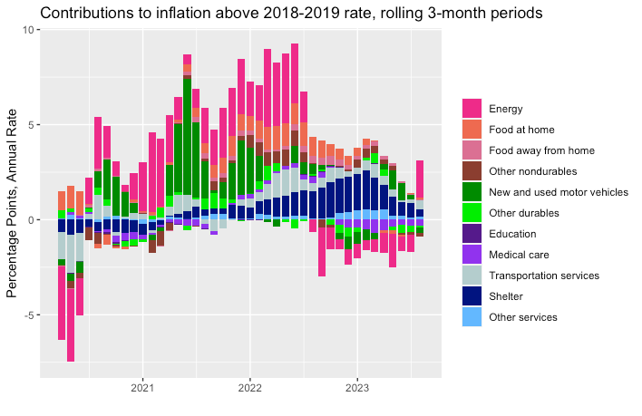
Line goes down, and up. Last week, I sent out a post arguing that the inflation problem is largely over, and the Fed had little to do with it. Yesterday, the new CPI numbers were released and they showed a sharp rise in inflation — a 4 percent rate over the past three months, compared with 2 percent when I wrote the piece.
Obviously, I’m not thrilled about this. It would be easier to make the arguments I would like to make if inflation were still coming down. But it doesn’t really change the story. Given that the spike last month is entirely energy, with growth in other prices continuing to slow, almost everyone seems to agree that it has nothing to do with demand conditions in the US, or anything the Fed has been doing or ought to do.
Here is an updated version of the main figure from the piece. You can see the spike at the far right – that’s the numbers released yesterday. You can also see that it is all energy costs (the pink bar). Everything else is still coming down.

Here is a table presenting the same data, but now comparing the high inflation of June 2021-June2022 with the lower inflation of the past year. The last column shows how much each category has contributed to the change in inflation between the two periods. As you can see, the fall in inflation is all about goods, especially energy and cars. Services, which is where you’d expect to see any effects of a softening labor market, have not so far contributed to disinflation.

One thing the figure brings out is that we have not simply had a rise and then fall in inflation over the past couple of years. We’ve had several distinct episodes of rising prices. The first, in the second half of 2020, was clearly driven by reopening and pandemic-related shifts in spending. (One point Arjun and I make in our supply-constraints article is that big shifts in the composition of spending lead to higher prices on average.) The next episode, in the second half of 2021, was all about motor vehicles. The third episode, in the first half of 2022, was energy and food prices, presumably connected to the war in Ukraine. Finally, in later 2022 and early this year, measured inflation was all driven by rising housing costs.
Even though they may all show up as increases in the CPI, these are really four distinct phenomena. And none of them looks like the kind of inflation the Fed claims to be fighting. Energy prices may continue to rise, or they may not — I really have no idea. But either way, that’s not a sign of an overheated economy.
It’s the supply side. Of course I am not the only one making this point. Andrew Elrod had a nice piece in Jacobin recently, making many of the same arguments. I especially like his conclusion, which emphasizes that this is not just a debate about inflation and monetary policy. If you accept the premise that spending in the economy has been too high, and workers have too much bargaining power, that rules out vast swathes of the progressive political program. This is something I also have written about.
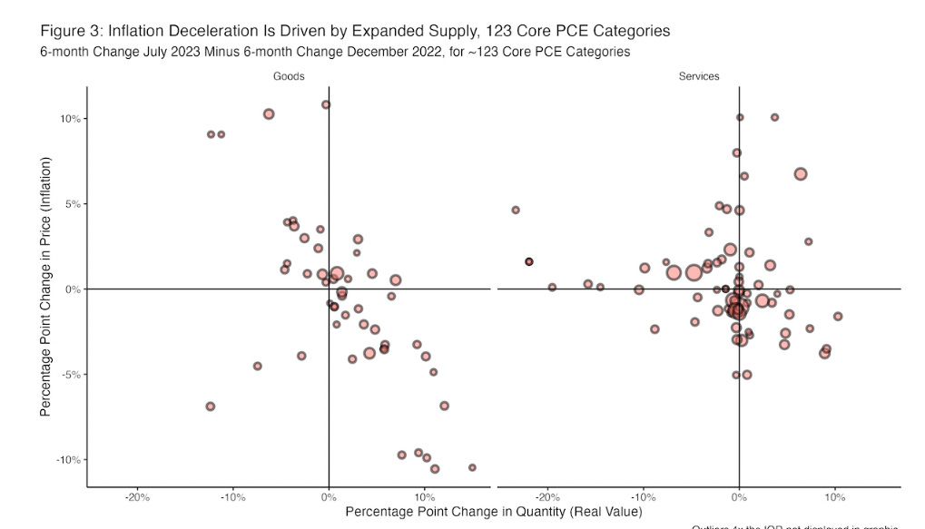
Mike Konczal makes a similar argument in a new issue brief, “Inflation is Down. It’s a Supply-Side Story.” He looks at two pieces of evidence on this: different regression estimates of the Phillips curve relationship between unemployment and inflation, and second, expenditure and price changes across various categories of spending. I admit I don’t find the regression analysis very compelling. What it says is that a model that used past inflation to predict future inflation fit the data pretty well for 2020-2022, but over predicted inflation this year. I’m not sure this tells us much except that inflation was rising in the first period and falling in the second.
The more interesting part, to me, is the figure below. This shows quantities and prices for a bunch of different categories of spending. What’s striking about this is the negative relationship for goods (which, remember, is where the disinflation has come from.)

It is literally economics 101 that when prices and quantities move together, that implies a shift in supply; when they move in opposite directions, that implies a shift in demand. To put it more simply, if auto prices are falling even while people are buying more automobiles, as they have been, then reduced demand cannot be the reason for the price fall.
Larry Summers, in a different time, called this an “elementary signal identification point”: the sign the price increases are driven by demand is that “output and inflation together are above” their trend or previous levels. (My emphasis.) Summers’ point in that 2012 article (coauthored with brad DeLong) was that lower output could not, in itself, be taken as a sign of a fall in potential. But the exact same logic says that a rise in prices cannot, by itself, be attributed to faster demand growth. The demand story requires that rising prices be accompanied by rising spending. As Mike shows, the opposite is the case.
In principle, one might think that the effect of monetary policy on inflation would come through the exchange rate. In this story, higher interest rates make a country’s assets more attractive to foreign investors, who bid up the price of its currency. A stronger currency makes import prices cheaper in terms of the domestic currency, and this will lower measured inflation. This is not a crazy story in principle, and it does fit a pattern of disinflation concentrated in traded goods rather than services. As Rémi Darfeuil points out in comments, some people have been crediting the Fed with US disinflation via this channel. The problem for this story is that the dollar is up only about 4 percent since the Fed started hiking — hardly enough to explain the scale of disinflation. The deceleration in import prices is clearly a matter of global supply conditions — it is also seen in countries whose currencies have gotten weaker (as the linked figure itself shows).

Roaring out of recession. I’ve given a couple video presentations on these questions recently. One, last Friday, was for Senate staffers. Amusingly —to me anyway — the person they had to speak on this topic last year was Jason Furman. Who I imagine had a rather different take. Then on Monday I was on a panel organized by the Groundwork Collaborative, comparing the economic response to the pandemic to the response to the financial crisis a decade ago. That one is available on zoom, if you are interested. The first part is a presenation by Heather Boushey of the Council of Economic Advisors (and an old acquaintance of mine from grad school). The panel itself begins about half an hour in, though Heather’s presentation is of course also worth listening to.


Be the first to comment