
This may be explicitly about the houing situation in Britain, but a number of its conclusions can be carried over to other EU nations.
By Ian Mulheirn, Director of Consulting at Oxford Economics
Cross-posted from the Resolution Foundation
At a time when politics has rarely been more divided, one major policy issue is a matter of cross-party consensus: we have a housing crisis. House prices were broadly unchanged from the mid-70s to the mid-90s, but have since exploded, rising by around 160% in real terms in just over 20 years. Almost everyone, from the Prime Minister down, agrees that ‘decades of undersupply’ are to blame for stratospheric prices.
Yet since house prices began their vertiginous ascent, new housing supply has comfortably outpaced household formation for England as a whole. As a result, while there were 660,000 more houses than households in 1996, that surplus had almost doubled to 1.25 million by March last year.
A growing surplus of houses isn’t, on its own, conclusive proof that there is no housing shortage. But these figures should make us question the conventional wisdom that high house prices are the result of a lack of places to live. I’ve been doing that over the past year, in a series of blogs looking at a range of evidence about what’s happening in the housing market.
Whenever those striking national surplus figures are pointed out, two important challenges are invariably raised. One is a story about how the housing shortage is really a local phenomenon, so national figures aren’t informative. The second is that supply may only have outstripped household formation because declining affordability has prevented many people setting up on their own.
In this blog I explore the evidence on both of these, showing that on both counts the data suggest that the rate of new housing supply has been more than sufficient for many years. Rather, the problems we see in the housing market are the product of two separate ‘crises’ neither or which can be solved by building more. I conclude by offering a framework for thinking about the different types of evidence that tend to be used in debates about the adequacy of housing supply.
The geography critique
The geography critique suggests that while we might not have a shortage nationally, we’ve not been building enough in parts of the country where people increasingly want to live. London, with its rocketing house prices, springs to mind — up almost 50% in since January 2013 alone, and a staggering 330% on 1996, adjusting for inflation. In the capital, if anywhere, there must be a housing shortage.
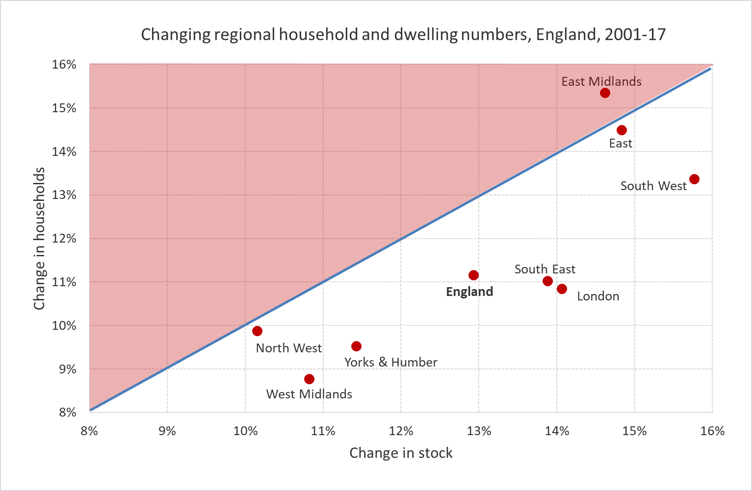
In fact, London and the South East have done reasonably well on housing supply in recent years, adding about 14% more houses but only 11% more households since 2001. The chart below plots the change in households against the change in housing stock for each region of England. Anything in the red zone, north of the 45-degree line, would be a region where stock has grown slower than the number of households — the red-shaded ‘supply shortage’ zone — while anything below it is in the ‘growing surplus’ zone. Regions representing two thirds of English households are comfortably in the ‘growing surplus’ zone. Three regions sit close to the line, suggesting supply has broadly kept pace, with only one of those creeping into the ‘supply shortage’ zone. Not much evidence of a local shortage story here.
The affordability critique
As I’ve pointed out before, despite this apparently benign picture we can’t look at housing volumes alone to determine whether supply has been adequate. This is also something that Kate Barker and Neal Hudson raised in a blog for the Resolution Foundation late last year. What if growing numbers of second homes, Airbnb, and buy-to-hold investors are taking large chunks of that supply out of circulation for residents? If so, the effective supply may be less healthy than the raw volumes data suggest. As a result, the cost of housing could be pushed up, choking off the rate of new household formation as people struggle to afford the costs.
Tracking changes in average housing affordability is therefore the best metric we have of whether housing supply has been growing at an adequate rate. If effective supply is increasingly constrained, we should see that reflected in the cost of housing taking up a growing chunk of household incomes — and hence falling average affordability.
The appropriate measure of housing costs is obviously rent, for renters. But the ‘rental equivalent’ that would be charged on an owner occupier’s house is also the appropriate measure of the cost of owning a house. (For more on why so-called ‘rental equivalence’ is a good way to measure housing costs for owner occupiers, see here and here.) So we can use the ONS’s Index of Private Housing Rental Prices, which tracks rents over time on a like-for-like basis, as a barometer for housing costs in both the private rented and owner occupied sectors.
Kate and Neal show that on this measure rent has outpaced average earnings since decent data started to be collected in 2005. But earnings is the wrong measure. ONS’s Average Weekly Earnings (AWE) measures the average across those individuals in work. This is no use if we want to assess average affordability for households. Instead we need to use a measure of disposable household income. Such measures capture effects like the rise of employment and self-employment rates to record levels in recent years, growing pensioner incomes, and changes to taxes and benefits.
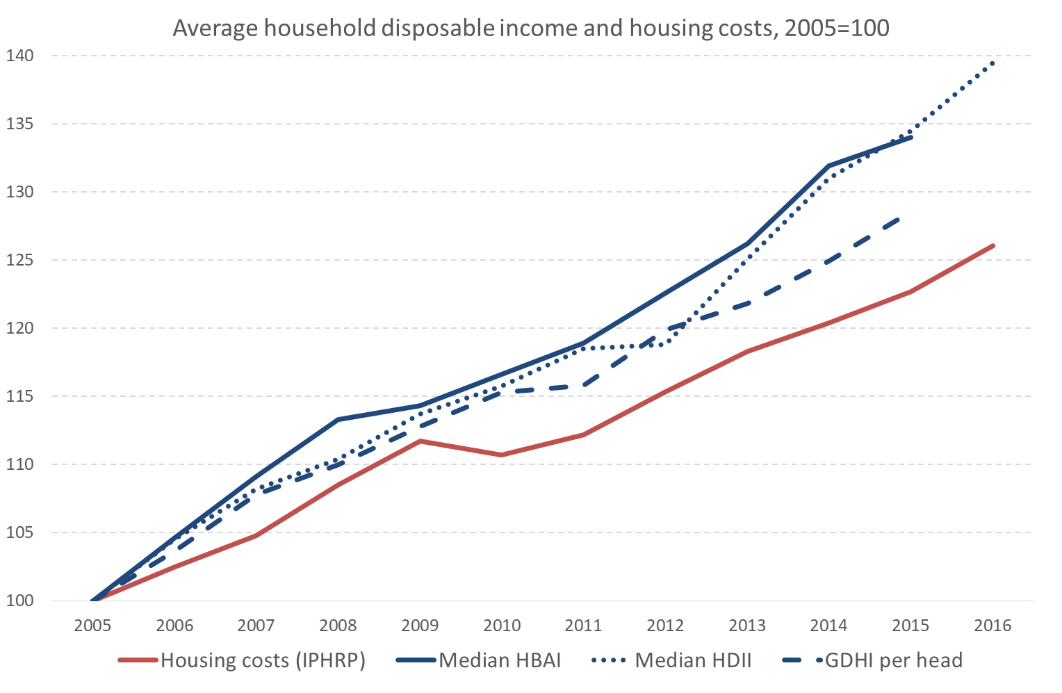
The chart below shows how housing costs have evolved in comparison with three official measures of household disposable income since 2005. One is DWP’s household income measure, known as Households Below Average Incomes (HBAI). The second is the ONS’s Household Disposable Income and Inequality dataset. The third is a national accounts-based measure of the same thing – Gross Household Disposable Income (on a per-head basis). Each measure has its strengths and weaknesses, but all three show a consistent story: since 2005 average household incomes have comfortably outstripped housing costs.
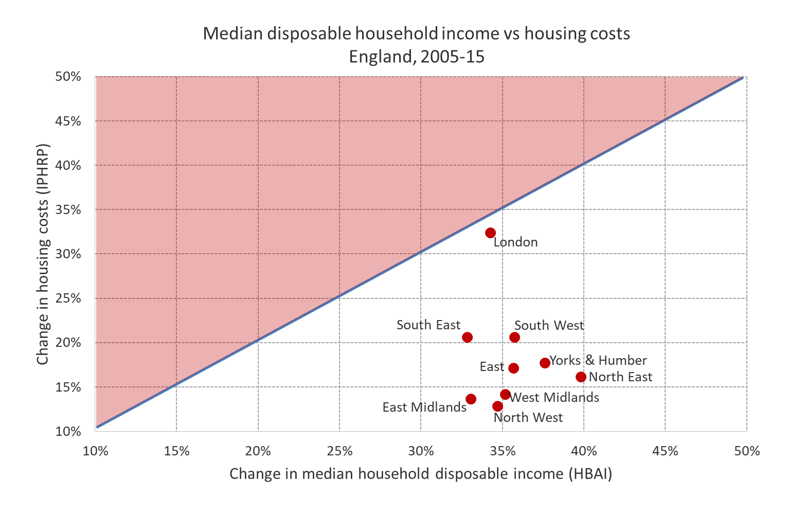
Regionally, too, average affordability seems to have improved in recent years. In the chart below, again, anything in the red ‘supply shortage’ zone is a region where housing costs have risen faster than average disposable income over the period, while any region below it has enjoyed housing costs that are — on average — taking up a diminishing portion of the average household’s disposable income.
Using the regional HBAI measure, it shows that there are no regions in England where housing costs have grown faster than average household income over this 11-year period. The one arguable exception to this improving picture is London, where housing costs appear to have tracked average income over the period. A higher rate of new supply here might help to bear down on costs, but there’s nothing here to suggest that London has seen a worsening housing shortage over this period.
All of this is, of course, exactly what we’d expect to see happening to housing costs in the wake of a growing surplus of dwellings over the past 25 years. Over the period for which we have decent data, we can see that average affordability of housing has been improving – even though house prices have rocketed. Hence we can be confident that a shortage of houses has not been the cause of our house price woes over the past quarter of a century. As Simon Wren Lewis and I have argued, blame for that lies squarely with low interest rates, mortgage regulation and foreign investors taking a shine to London property.
A framework for thinking about evidence in housing
None of this is to deny that housing affordability has undoubtedly declined in recent years for some people. For example, affordability for young people fell sharply in the years after the financial crisis as their wages took a hit. Chris Giles cites the Resolution Foundation’s work showing how out-of-pocket housing costs for Millennials take a bigger chunk of their incomes than was the case for Generation X. And in their blog, Kate and Neal go on to cite comparable evidence, including data showing larger numbers of young people living at home, and a rise in homelessness. Other factors have also been at play, with many households facing cuts to housing benefits and other transfers that directly reduce housing affordability. James Gleeson documents a rise in the number of concealed households.
All the evidence cited in these pieces is accurate. Some of it suggests that there may have been a rise in the number of would-be households that haven’t formed. So how can these insights be reconciled with the aggregate evidence above that housing supply has been improving for the past 25 years?
Housing costs as a proportion of some people’s incomes can rise either because housing costs have risen relative to average incomes — indicative of a shortage — or because some people’s incomes have fallen — suggesting that the problems lie instead in the changing distribution of income.
This suggests a framework for thinking about housing evidence, illustrated by the diagram below.
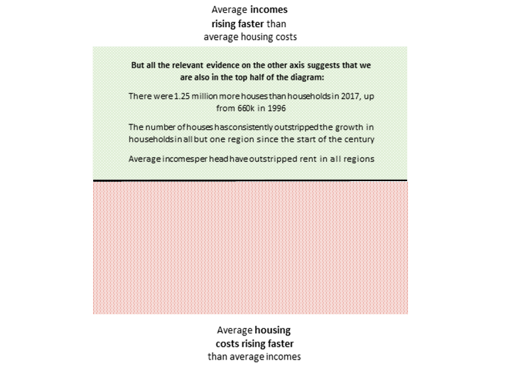
- The vertical axis measures the degree to which housing costs are rising or falling as a proportion of average incomes. Data that locates a region below the horizontal line suggests it has a worsening housing shortage, while anything above it has an improving supply situation since housing is getting more affordable.
- The horizontal axis captures changes in the income distribution. A region located on the right hand side would be characterised by falling income inequality, and falling numbers of suppressed households.
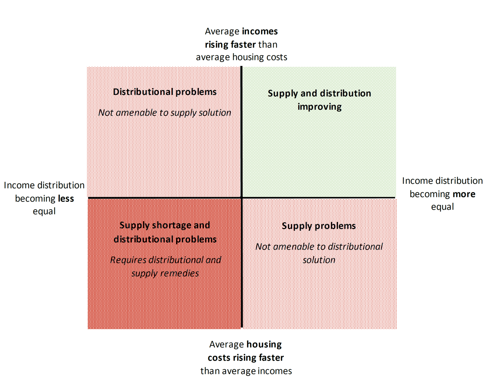
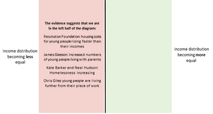
What the housing affordability (and, less directly, households-versus-stock) data tell us is that, with the possible exception of London, the country sits in the top half of the diagram.
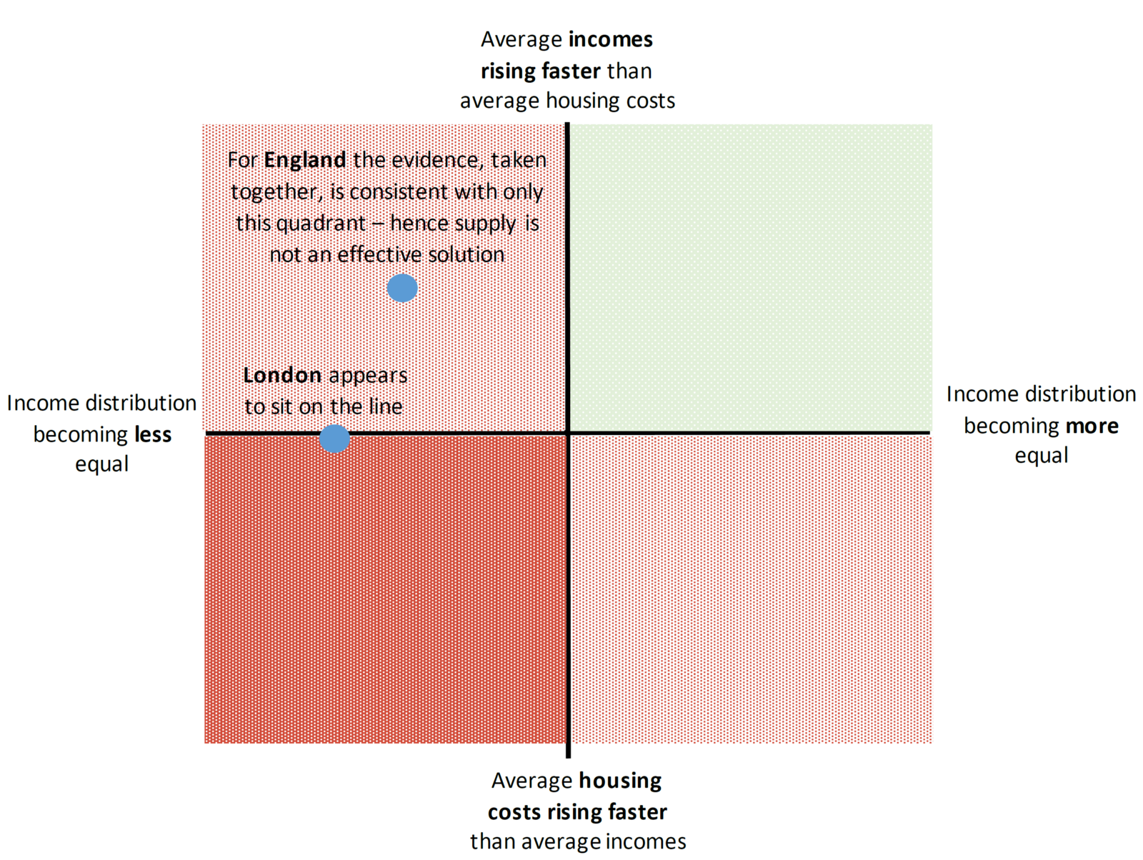
Rather than one housing crisis caused by ‘decades of undersupply’, then, we in fact face two distinct housing crises: deteriorating affordability for some due to adverse trends in their incomes, and high prices caused by financial conditions.
It’s true that greater supply would reduce rents and prices marginally. But most academic work on the subject tells us that no plausible amount of building will have a material impact on either problem. Oversimplifying our housing problems is leading policymakers down a blind alley – only when we grasp the real causes will we have a chance of solving the housing crises.


Be the first to comment